Christopher Hume –
There was a time, not so long ago, when bank buildings were among the most impressive in town. Today, it’s hard to tell the neighbourhood branch from the local Pizza Pizza. The banks have abandoned architecture for the cheap eye-catching appeal of bright colours, back-lit signage and sameness.
The message is clear: once august financial institutions have become run-of-the-mill corporate bottom feeders – in TD Bank’s case a criminal bottom feeder – more focused on taking than giving . Their buildings are no longer intended to impart a sense of safety, security and permanence, but to trumpet the availability of quick cash and slow debt.
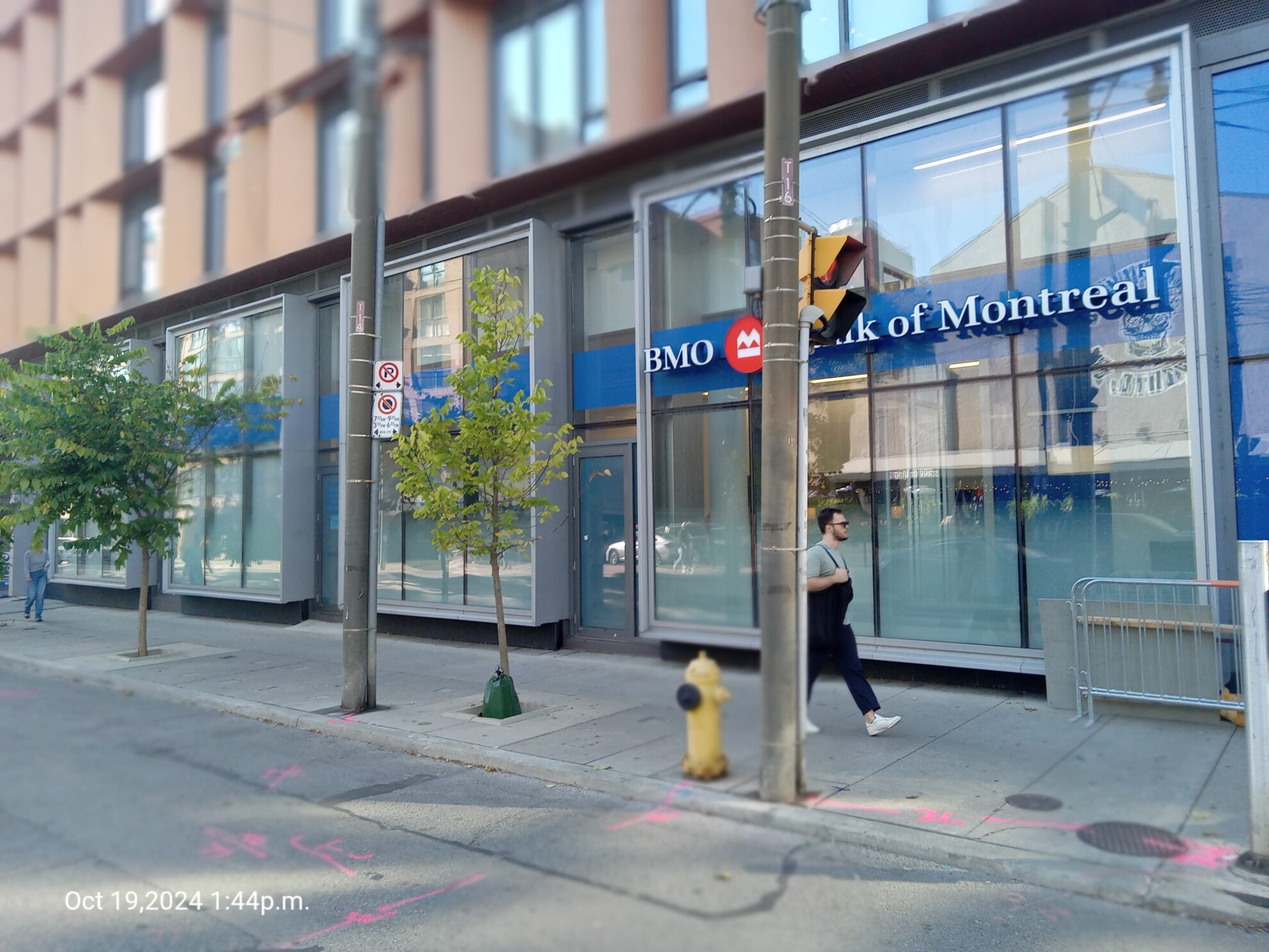
Like all Canadian cities, Toronto is awash in the banality of 21st century corporate culture. Countless corners are cluttered with the sort of hollow groupthink architecture that means banks now look pretty much the same. The main difference is colour: TD’s bile-green identifier competes with CIBC’s bilious burgundy and Scotiabank’s “bright vibrant red.” The banks’ (unintentionally hilarious) descriptions of their corporate colours reveal the extent to which Canada’s financial sector has swallowed their marketers’ Kool-Aid holus-bolus. BMO’s red, white and blue, we are told, “represent trust, passion and purity.” That’s one way of putting it. CIBC’s colours suggest “boldness, tradition and customer-centric values.” Of course!
On the page, such nonsense is risible. But repeated endlessly across the city, the effect is less amusing. Along with the Shoppers Drug Marts, Dollaramas, Starbucks, Tim Hortons and other corporate operators, banks have blanketed the city with a kind of monotony and sterility unimaginable before the age of plastic and electric lighting. Cities around the world, let alone Canada, have never looked more alike.
A walk through Toronto’s Old Town is as good a place as any to begin. Ours starts at King and Church Streets, where the majestic Cathedral Church of St. James has stood since the 1850s. The fourth religious structure erected on the site, it is a landmark, the place where Queen Elizabeth prayed when she visited in 2010.
Little wonder then that the sickly blue BMO branch across the road stands out in its vapidity, another example of the lack of architectural self-awareness blighting our communities. Compare this to the magnificent bank at the corner of Yonge and Front Streets built by the Bank of Montreal in 1888 and now home to the Hockey Hall of Fame. Turning a cathedral of commerce into a shrine to shinny was accomplished with remarkable ease.
And let’s not forget the CIBC on the north side of King just west of Church. It has among the blankest of blank facades, almost malevolent in appearance. “Stay away,” it seems to say; “You’re not welcome here.”
The decline in bank architecture has indeed been painful and precipitous. The point is not that the banks no longer build ornate Beaux-Arts heaps, but that they no longer aspire to excellence – they have lost the maturity to grasp the need to engage the city with more than mindless marketing. Where once a bank branch signalled optimism and pride, at best it now attempts little more than to grab our attention at any cost. Consider the row of “bankfronts” on King east of Sherbourne: contemporary retail architecture in all its exhaustion. An empty facade topped with a company logo is about the best we can hope for today.
Lest we fall into the trap of believing that modernism made such dullness inevitable, the exquisite TD banking pavilion at King and Bay reminds us otherwise. Designed in the 1960s by Ludwig Mies van der Rohe, and commissioned by then TD chair Allen Lambert, it was one element of the multi-building complex that (along with New City Hall) brought Toronto kicking and screaming into the modern age.
With such an impressive legacy, perhaps it’s too easy for financial institutions to ride the coattails of their own histories. The goodwill we feel, if any, is also a relic of earlier times. The banks shouldn’t forget that the past is a foreign country. Sooner or later we will have no choice but to leave it behind.
Christopher Hume is the former architectural critic for the Toronto Star.


